Visualizing a project portfolio Timeline
As someone who has not managed projects before, let alone manage project portfolios, so far it has been unclear to me how projects or portfolios are actually visualized on paper. Today I would like to talk shortly about a useful diagram I found that is used to visualize the status and deadlines of projects.
As you manage projects and portfolios, surely you will hold status meetings in which you would like to show the status of your projects and portfolios.
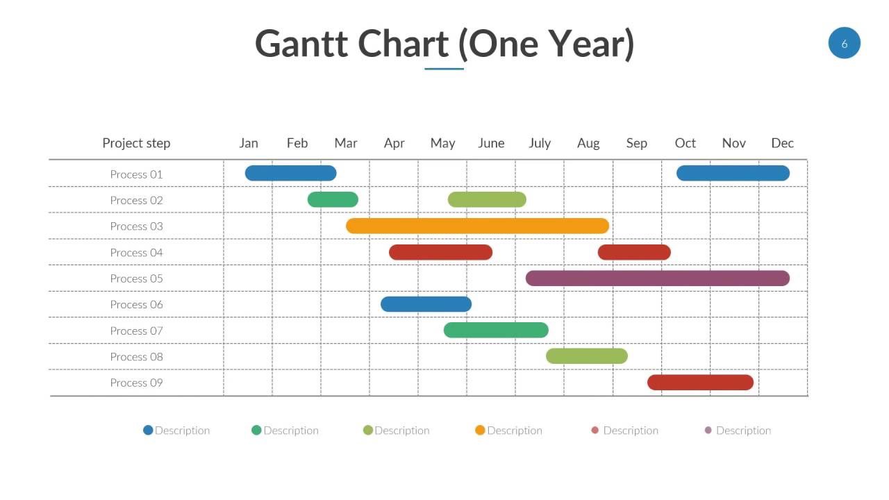
Obviously your stakeholders aren’t there when you’re actually doing the managing and but you would still like to visualize in some way how things are progressing in some sort of diagram. Meet the “Gantt of Gantts” chart:
This is chart gives you the ability to show case your most relevant projects, programs or portfolios in relation to time. A chart like this gives you an immediate overview of how all the projects are progressing and what their deadlines are. I’m sure you might be thinking “This is ridiculous. Why are we talking about a chart?” Again, as someone who hasn’t managed projects before, who’s really getting all of it’s project management knowledge from books and lectures, I actually had to go and discover what is actually used to convey status in the project management world. And, I found this to be a very nice and clear way to do so.
I do believe that it would be recommended to keep the list of projects short. It should contain only the projects that are relevant to the people who are going to see this chart often. Try to keep it simple as well. Don’t use too many colors and don’t split the individual progress bars per project. In my opinion, the chart loses its simplicity and doesn’t convey a clear message anymore due to complexities introduced in the chart. Before you know it, you’re introducing a complex legend that readers would need to use to compass their way around the chart. Lastly, if you want to convey more information, I would suggest making a copy of the same chart and prepare that copy to convey that particular information. Still keep the second chart simple however.
So there you have it, a “Gant of Gantts” chart. Useful for conveying the status and deadlines of projects, programs or portfolios. You can use this to give your stakeholders a simple overview of where it all stands.
I will definitely consider using this chart professionally if I ever get the task to manage projects!